
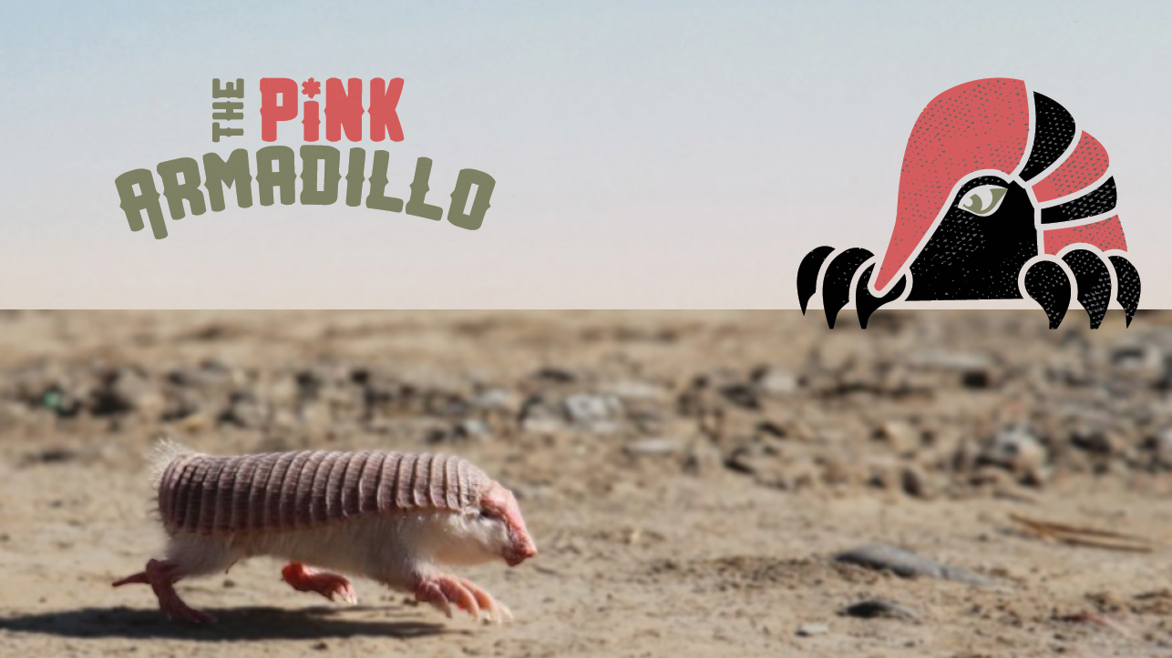
THE PINK ARMADILLO
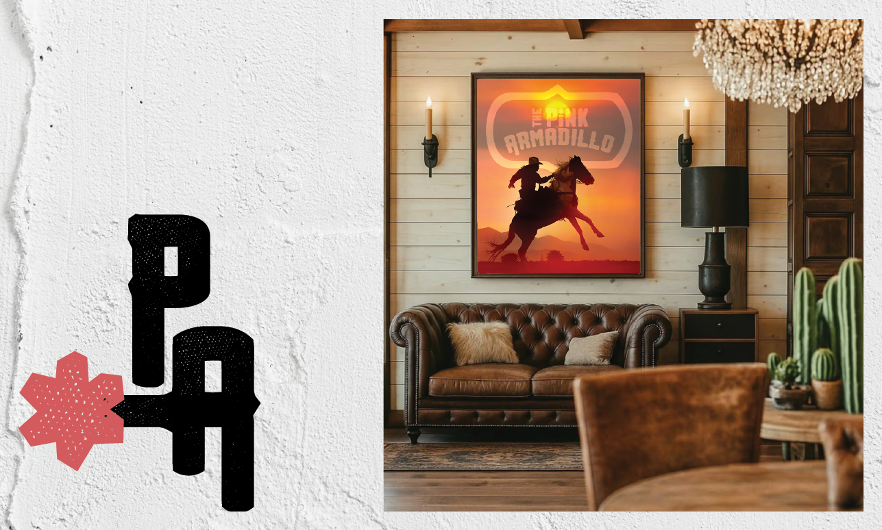
Pink Armadillo started as a world-building exercise; part brand, part place. I wanted it to feel like a place you could actually go, with warmth, character, and a little bit of grit. The identity pulls from ideas of slow living, land, and experience, shaping a visual system that feels both grounded and inviting. It’s less about a single logo and more about creating a full atmosphere, something that can stretch across touchpoints and still feel cohesive.
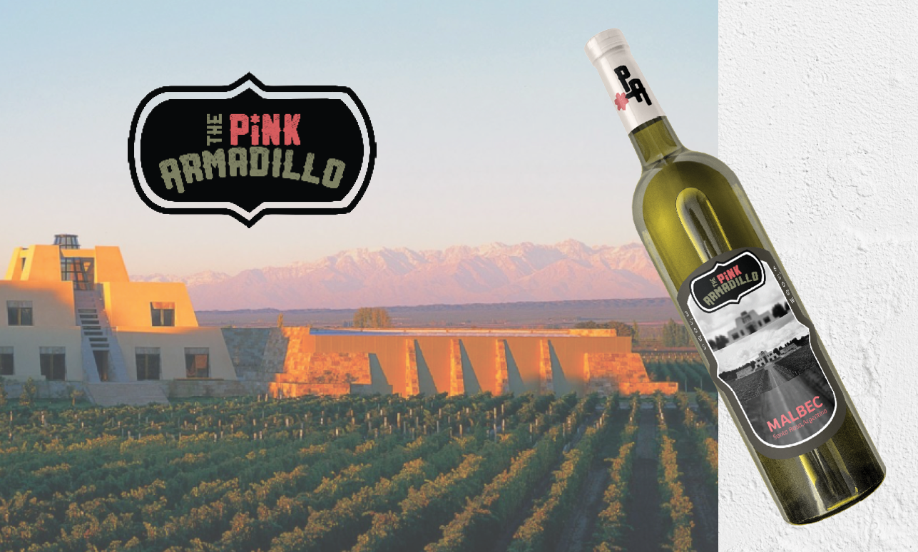
The Pink Armadillo Estancia honors the rare and the real.
Where vineyard rows meet open land, this project draws inspiration from Catena Zapata and the quiet rarity of the pink fairy armadillo. It imagines an eco*tourism space where wine and matcha rituals slow the pace, where cultivation and conservation coexist. Rooted in the rhythms of the land, each detail considers soil, water, and habitat, creating a place that feels intentional, restorative, and gently connected to its surroundings.

This project was created for an academic assignment. Select imagery is sourced and used for educational purposes only and is not intended for commercial use. All rights remain with the original creators.